First Up, A Disclaimer
The document is no shape or form to be written off as complete. It is a work in progress and as such should be treated as one. Until I finish this document, please try to overlook my spelling mistakes, incorrect info and my lame puns.
Thirteen Common mistakes in Dashboard Design
Exceeding the boundaries of a single screen
- no scrolling
- take into account aspect ratios
- responsive grids can help
- mobile to desktop layouts must be intuitive
Supplying inadequate context for the data
- more is not always better
- when more provides real value it should be included such that it provides an overview without distraction
- provide visually prominent primary data with subdued secondary information
- avoid subtle secondary that is non intuitive or confusing
- minor fonts and possible teaser information that could be clicked on for even more broader secondary info
Displaying excessive detail
- measures expressed to precisely
- e.g. $3,848,305.43 vs $3.8M
- keep it to high level info
- every unnecessary piece of info results in time wasted, as the user has to cognitively filter information.
Expressing measures indirectly
- must know units being measured
- variance of data versus actually shooing the explicit amount.
- e.g. -9% versus $75,300
- TODO Pic
Choosing inappropriate display media
- choose appropriate data representation.
- avoid pie charts always
- us the most simple and familiar media
- complex graph vs simple table
- simple bar graphs are easy and quick to understand
Introducing meaningless variety
- don't use variety just for the sake of it.
- always select the display medium that works best even if that result in a dashboard filled with multiple instances of the same type of graph
Using poorly designed display media
- stay away from 3d, gauges, pies, colors that blend together
Encoding quantitate data inaccurately
- start bar scales at zero
Arranging information poorly
- most important info should be prominent
- data should be visually designed and arranged to encourage comparisons
Highlighting important information ineffectively
- if everything on the dashboard shouts for attention, nothing will be heard
Cluttering display with visual effects
- avoid useless embellishment
- use flat designs
Misusing or overusing color
- avoid red green
- think about color blindness
- think about screen size
- white on black for descriptions
- black on white for quick info
Designing unattractive display
- modern day ui techniques should be considered
- fonts and css styles should be minimal but subtle
Interesting Bar Charts
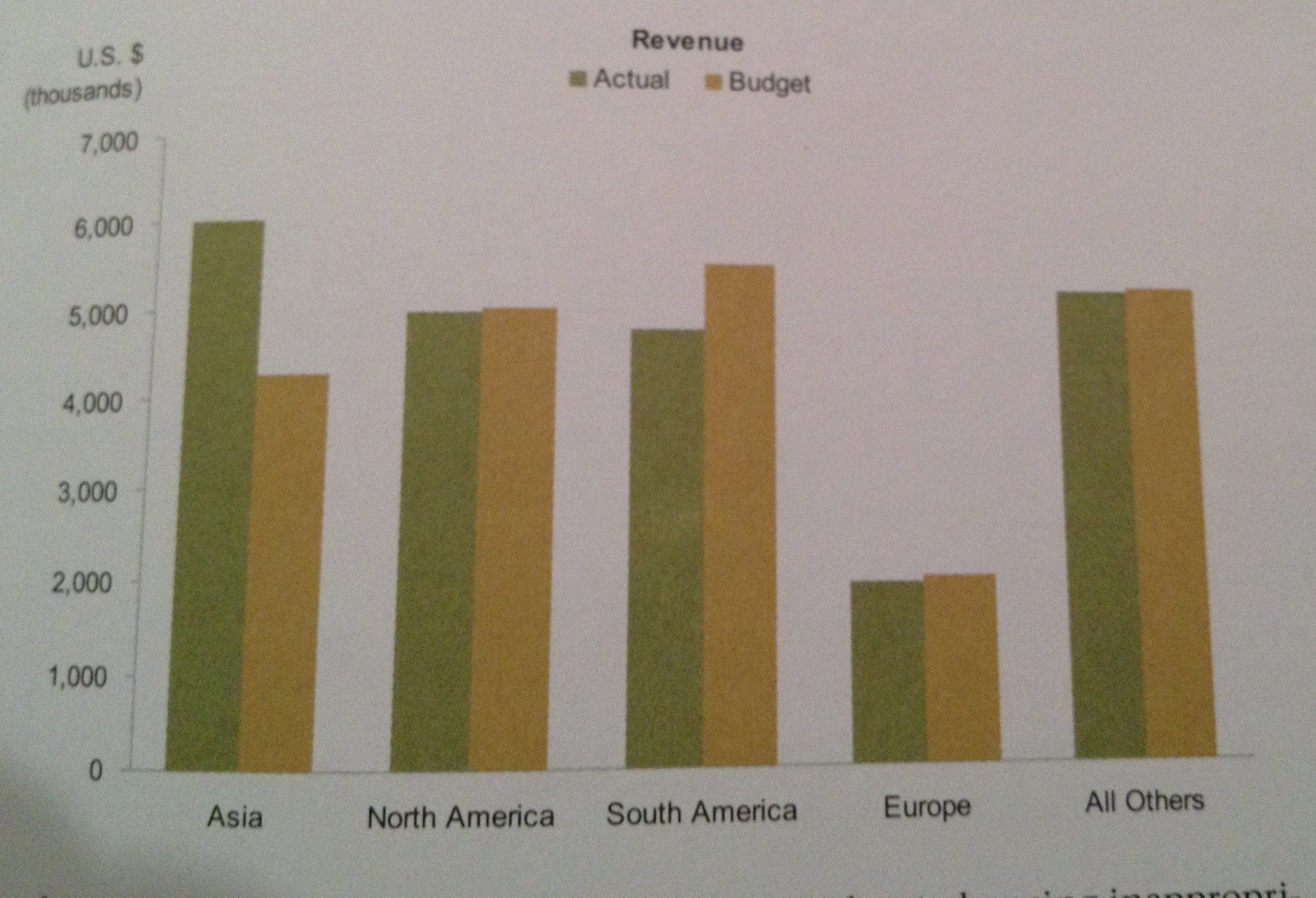
I like this bar graph for the following reasons
- Lower axis doesn't have tick marks which show to the reader the lower axis is not a continuous but categorical description of each grouped bar
- The legend is visually prominent and in a position to be read first before scanning the chart
- The quanitivie axis is labeld clearly and the level of grainularity for the numbers is not too low.
- Subtle axes with their gray colors and thin lines
- Contrasted and flat colors for the bars is a modern looking style.
Interesting Indicators
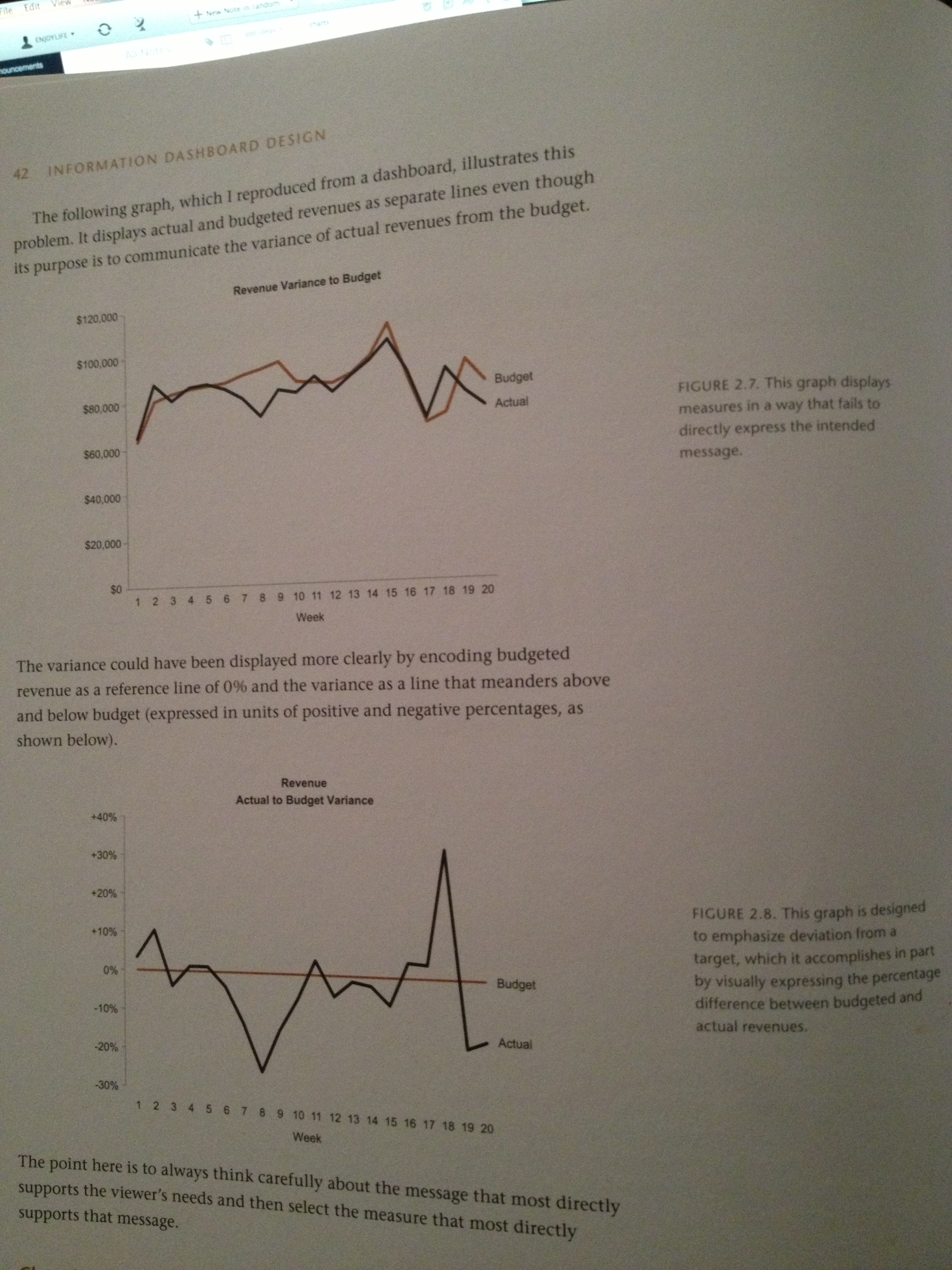
Trend line more clearly shows the variance that is intended to be compared.
Assessing what's needed
It is often more challenging to asses what people truly need than it is to design system. This is true with developing anything that involves human interaction with technology. Begin with a definition
Clearly define the dashboards purpose. Which is to rapidly monitor performance and changes in data of the relevant realm of concern. "Performance monitoring tool"
- Focus on goals not the means
- Get into people's heads
- Ask the right questions
- Identify information that truly matters
- Identify useful context for measures
Dashboards and graphs come alive and are meaningful when numbers are compared to related values.
Related values such as targets, standards, measures of the norm, or past data. The relation may be complex or hard to decipher in its currently known form but the role of the dashboard or info graphic is to rapidly high light the relevant info.
Without context measures cannot do this.
Fundamental question to ask When trying to make sense of Numbers is "Compared to what?"
Sources
- Few , Stephen. Information Dashboard Design: The Effective Visual Communication of Data. Beijing: O'Reilly, 2006. Print.
- Few, Stephen. Show Me the Numbers: Designing Tables and Graphs to Enlighten. Burlingame, Calif: Analytics, 2012. Print.